Darienzo - Packaging design
Brief: To create Branding, bottle and skin care kit packaging that would stand out amongst the noise of a challenging market (Personal Project)
Branding, packaging design
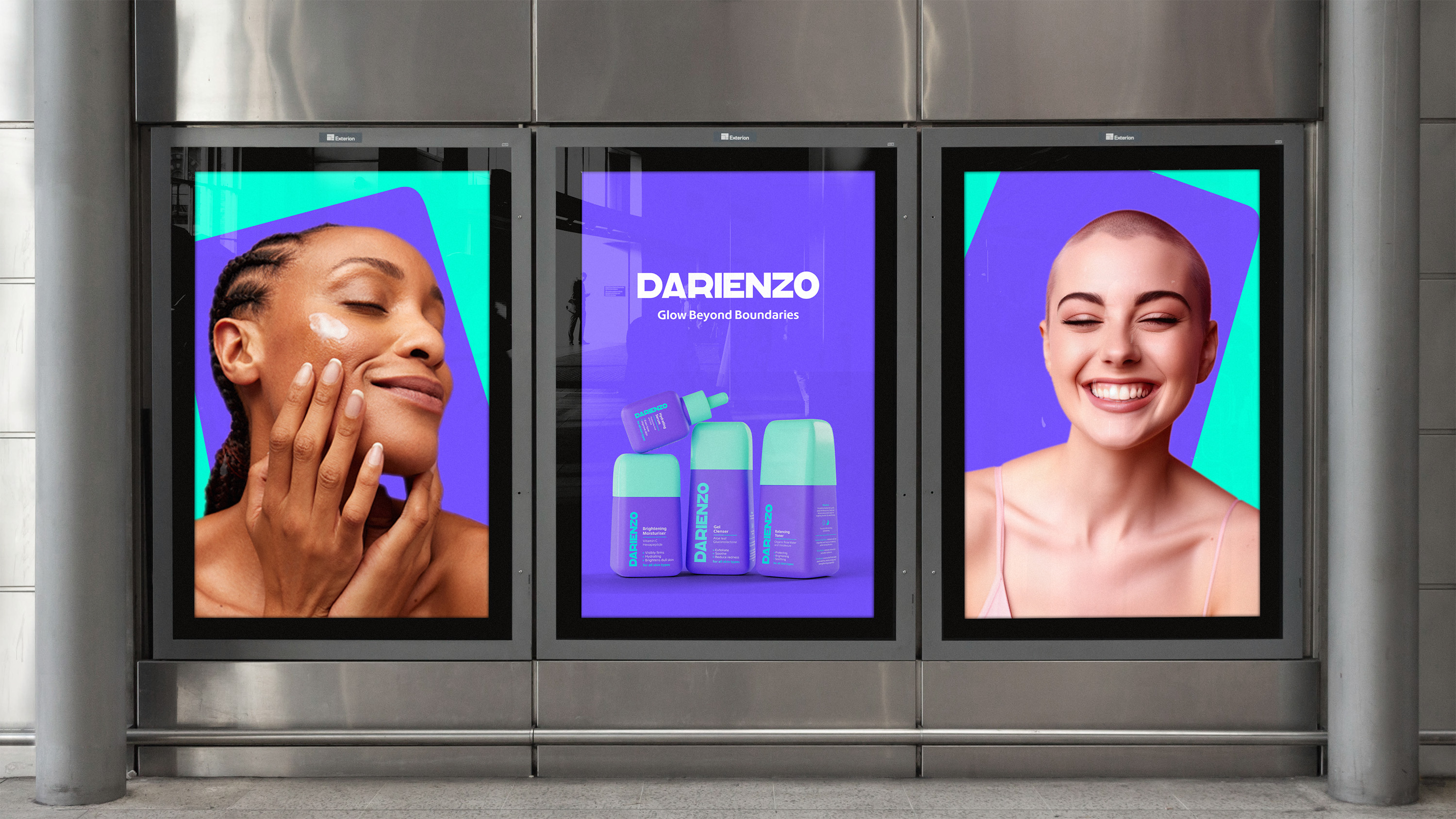
I aimed to craft distinctive and playful packaging for a line of skincare products amidst a crowded market. Recognising the necessity of standing out, I developed a vibrant brand characterised by bold packaging.
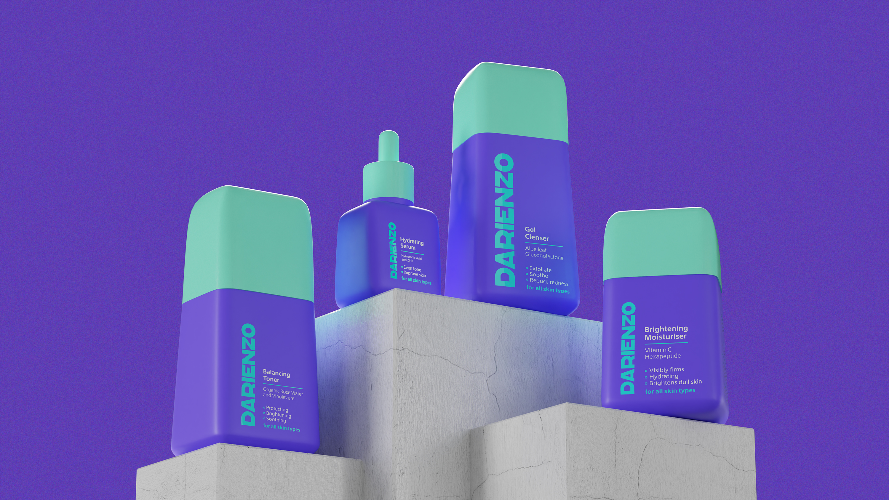
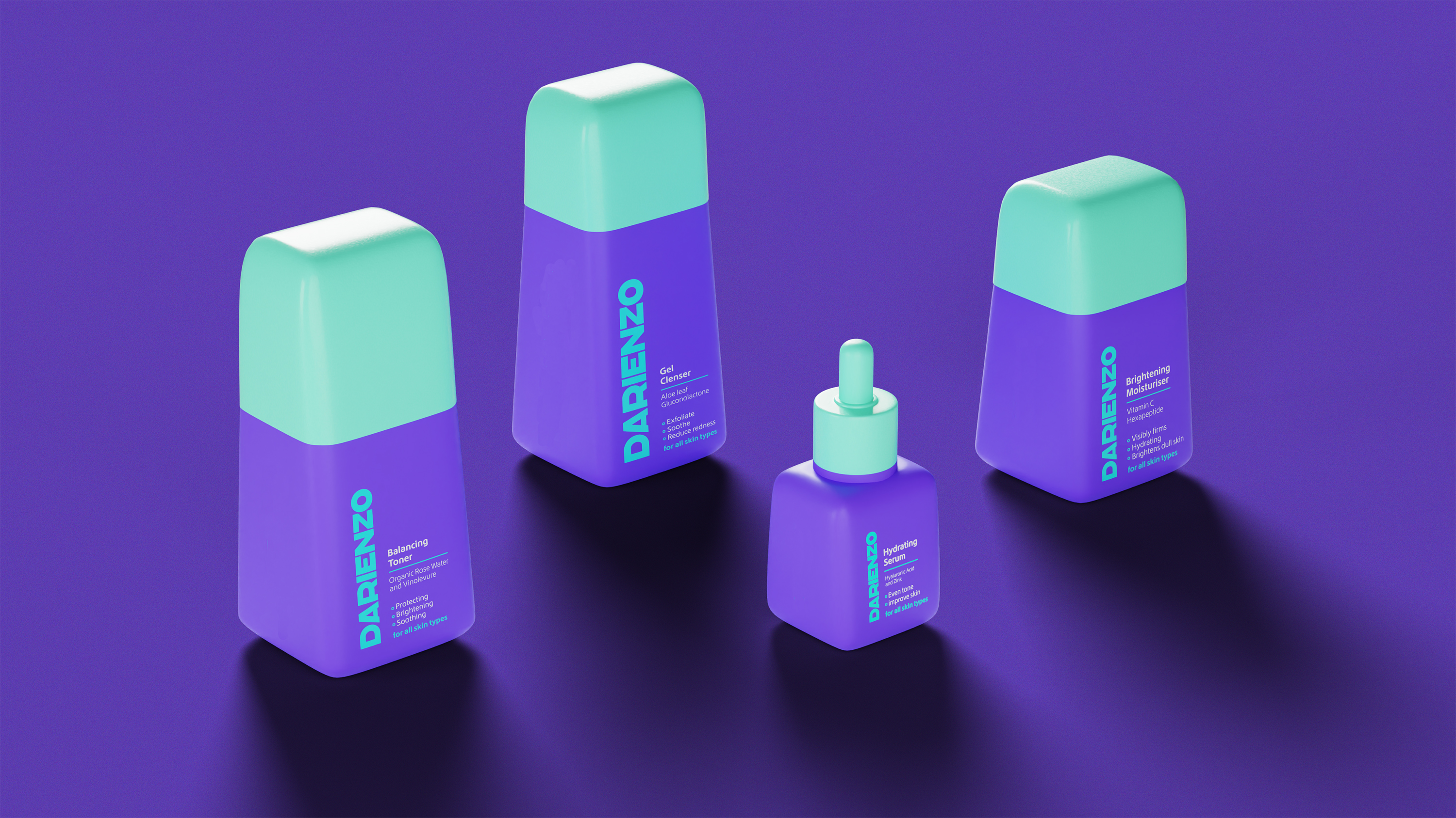
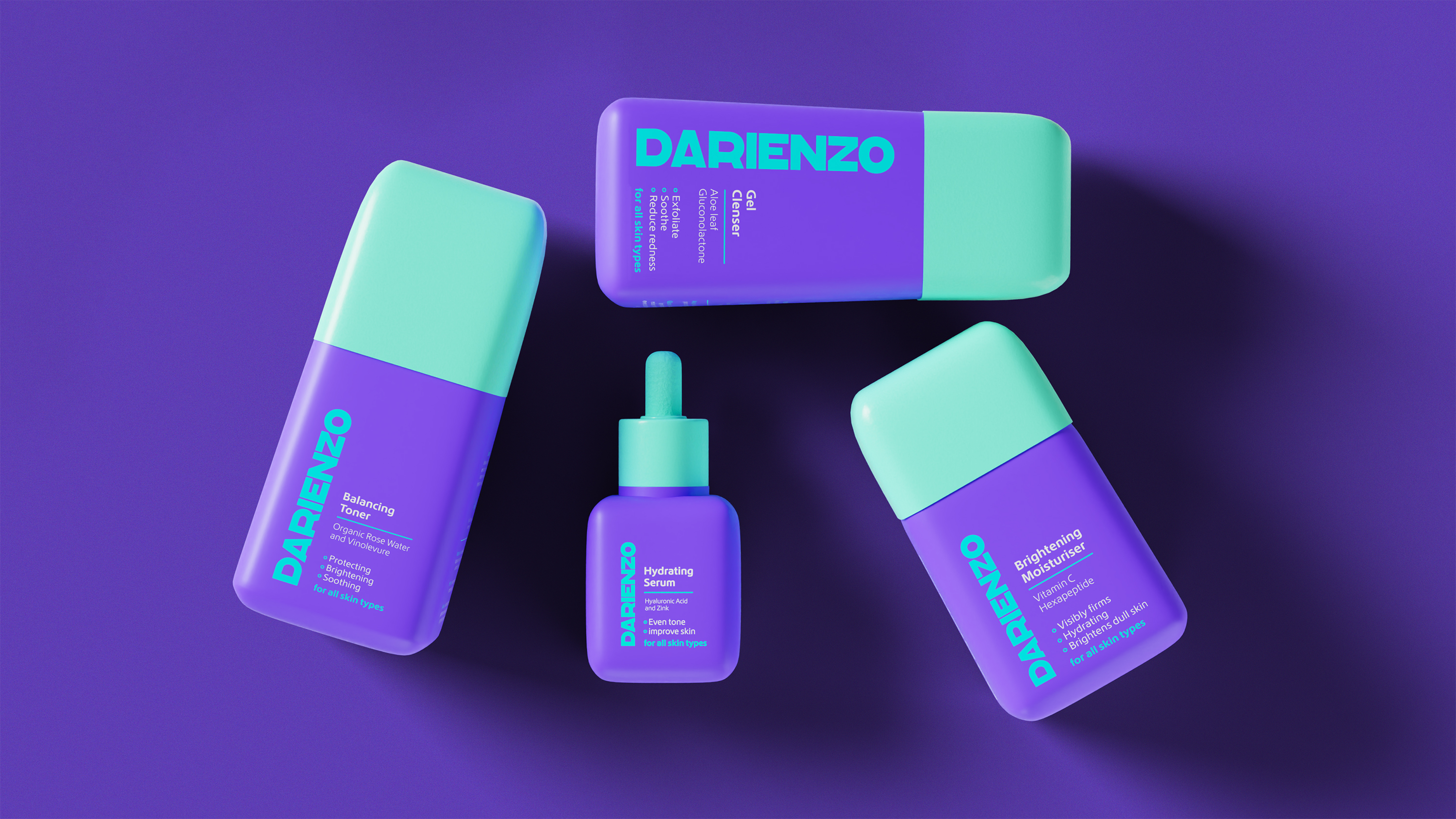
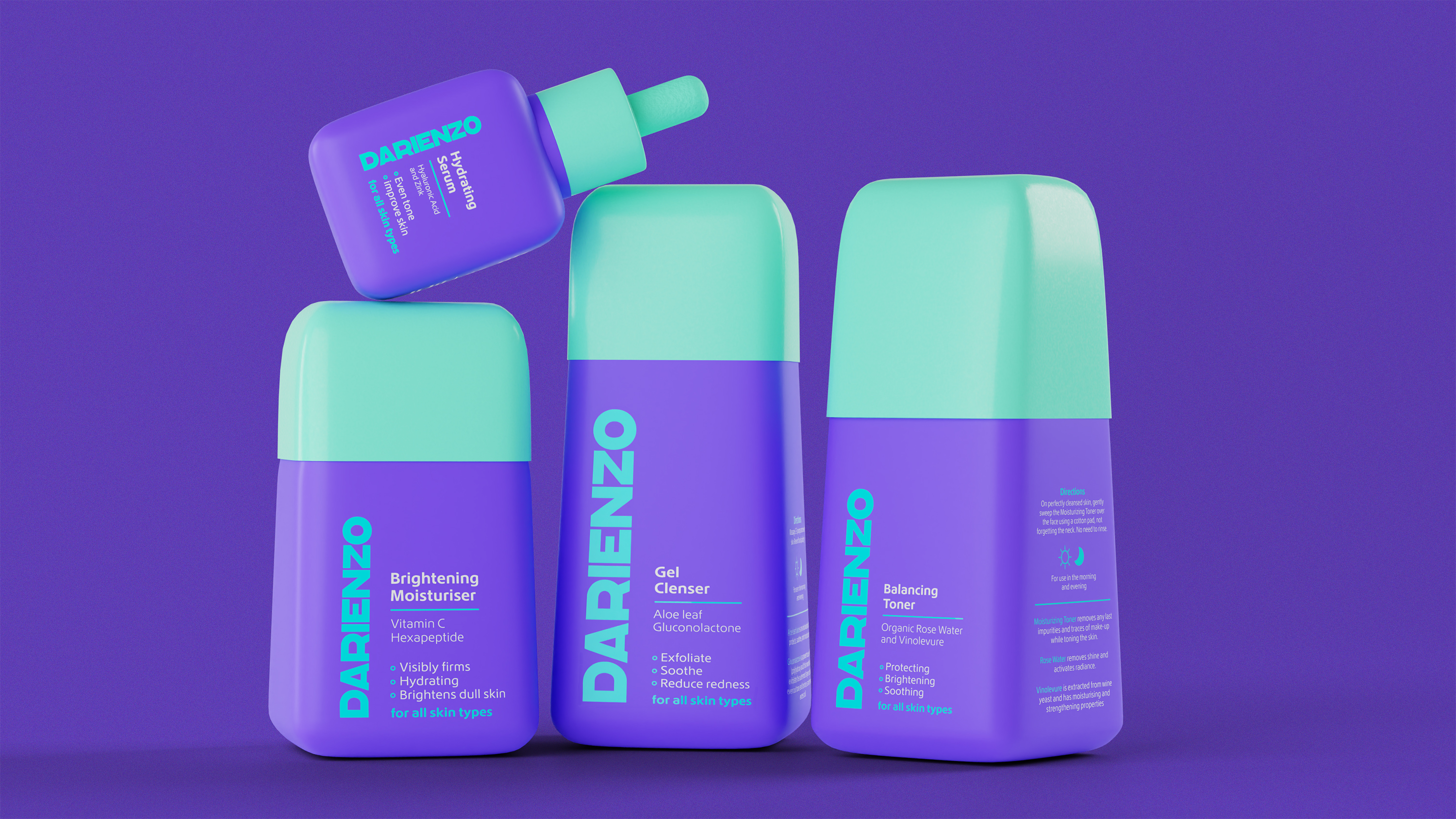
Beginning with the creation of a robust brand identity I translated it into recognisable bottle designs. Opting for softly rounded bottles tapering at the top, I felt this aesthetic complemented the brand's essence evoking a sense of both care and a quirky nature. Utilising the brand's primary colours along with white for text, I used the teal to draw attention to key information.
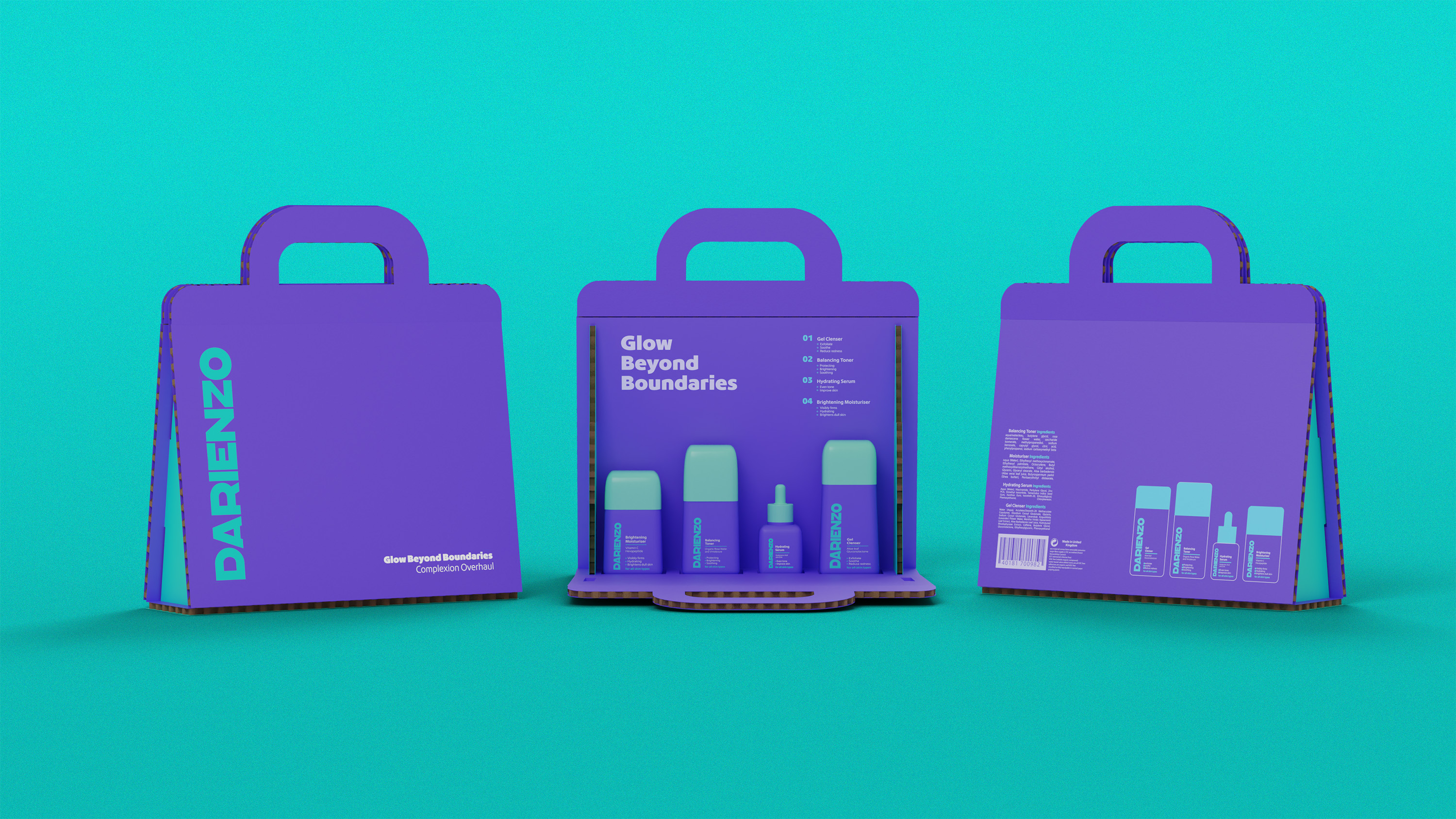
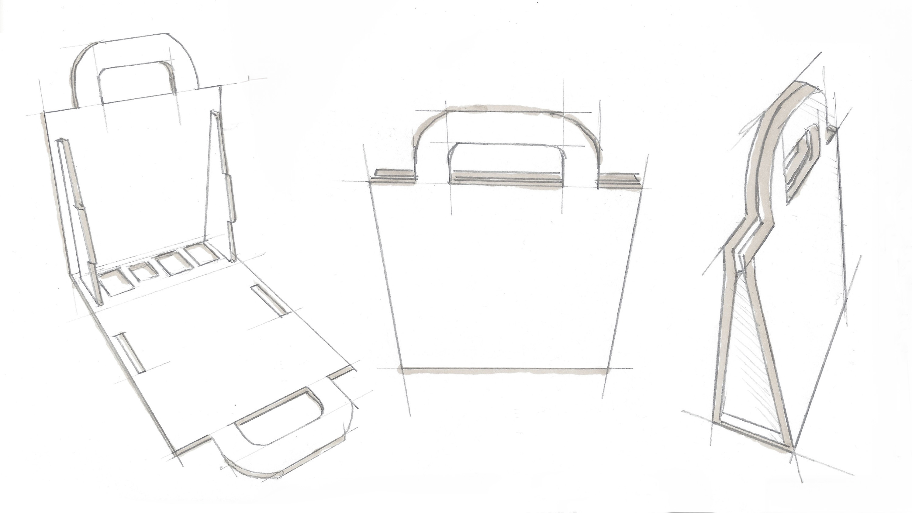
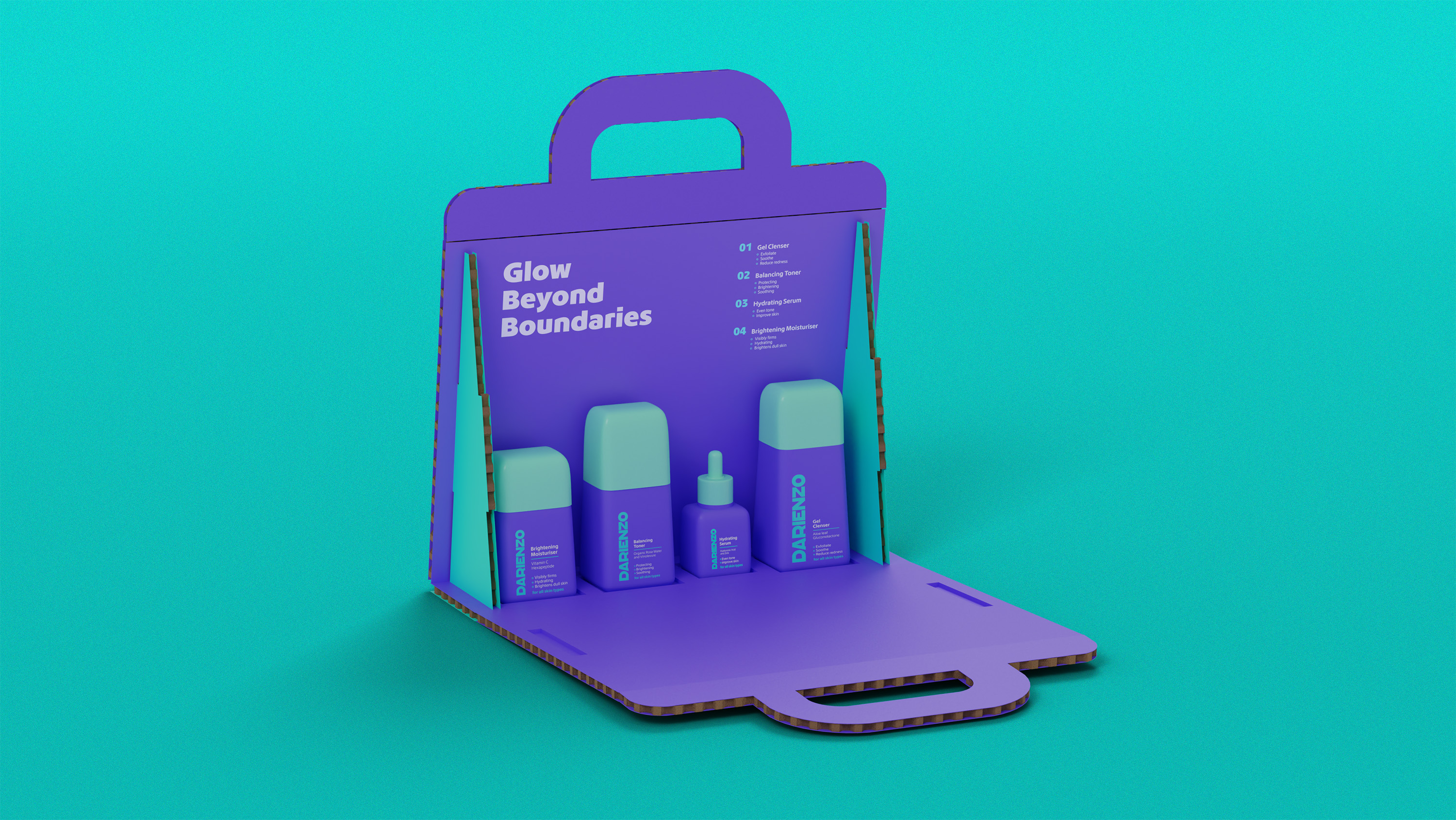
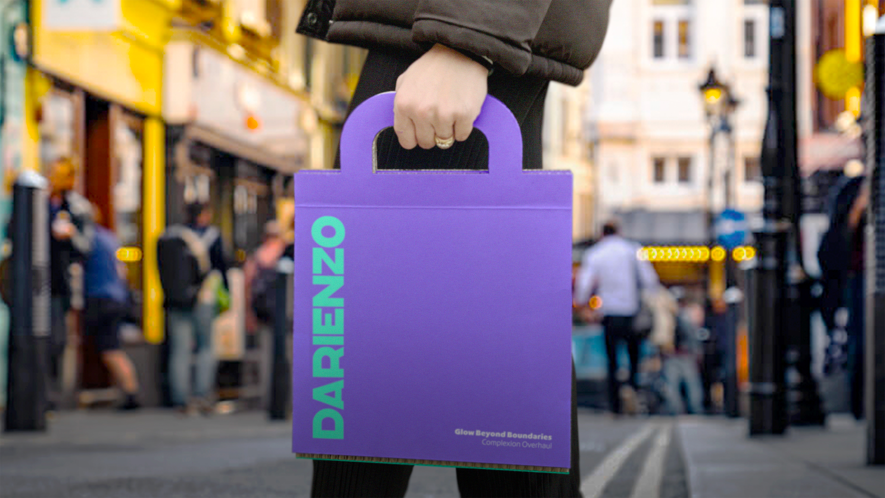
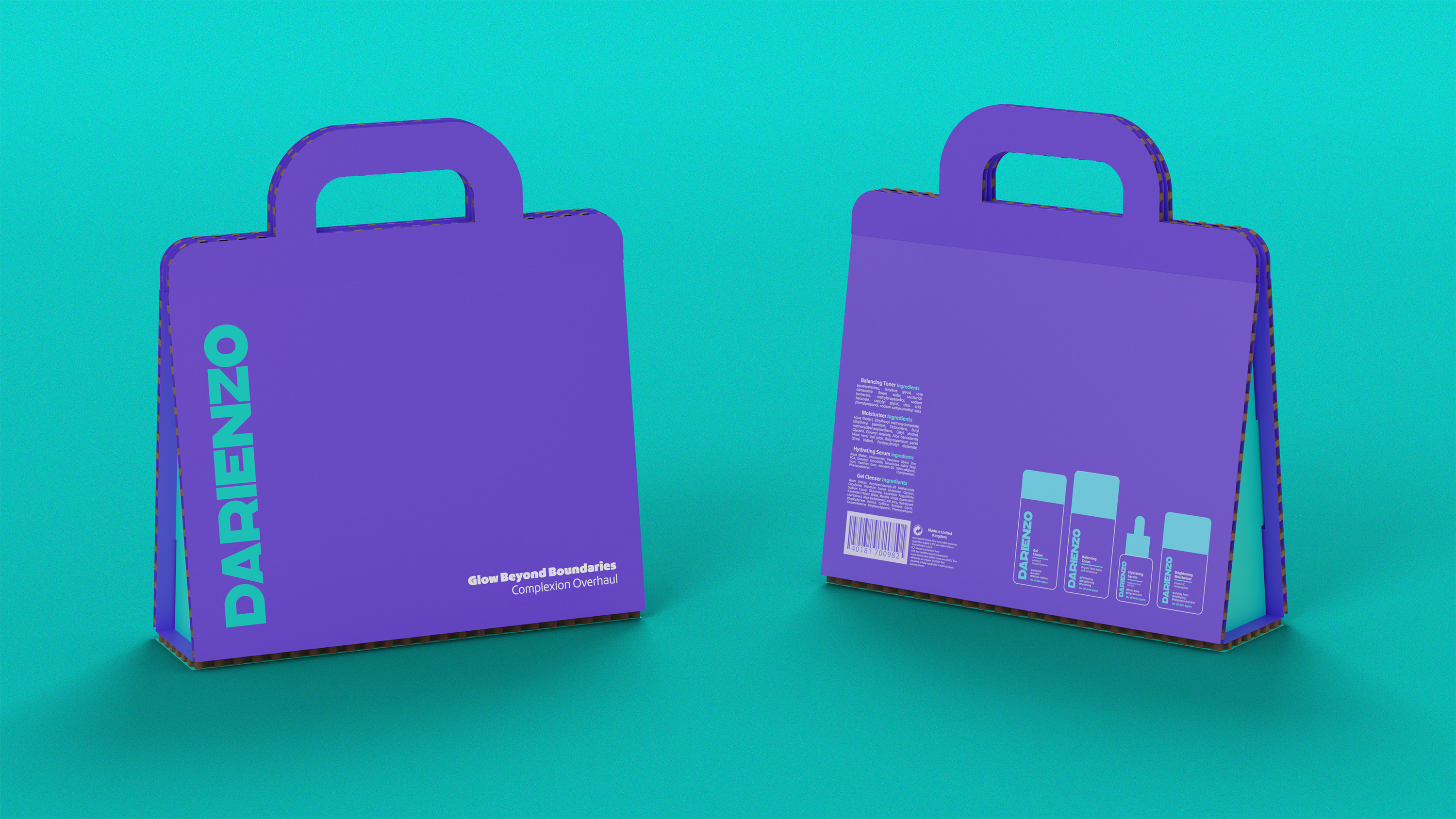
For the outer packaging, my goal was to design something memorable and conversation-worthy. After exploring various concepts I settled on the idea of the packaging doubling as a bag. This unique approach peaks curiosity among potential customers.
Sustainability was paramount, leading me to select a 10mm thick board crafted from post-consumer kraft, which is fully recyclable and repulpable. This eco-conscious choice not only enhances the packaging's carbon footprint but also provides a sturdy and resilient solution suitable for travel.
Beginning with the creation of a robust brand identity I translated it into recognisable bottle designs. Opting for softly rounded bottles tapering at the top, I felt this aesthetic complemented the brand's essence evoking a sense of both care and a quirky nature. Utilising the brand's primary colours along with white for text, I used the teal to draw attention to key information.
For the outer packaging, my goal was to design something memorable and conversation-worthy. After exploring various concepts I settled on the idea of the packaging doubling as a bag. This unique approach peaks curiosity among potential customers.
Sustainability was paramount, leading me to select a 10mm thick board crafted from post-consumer kraft, which is fully recyclable and repulpable. This eco-conscious choice not only enhances the packaging's carbon footprint but also provides a sturdy and resilient solution suitable for travel.