Nonnas
Brief: To design branding and packaging for authentic Italian pasta kits (Personal Project)
Brand identity, Packaging design
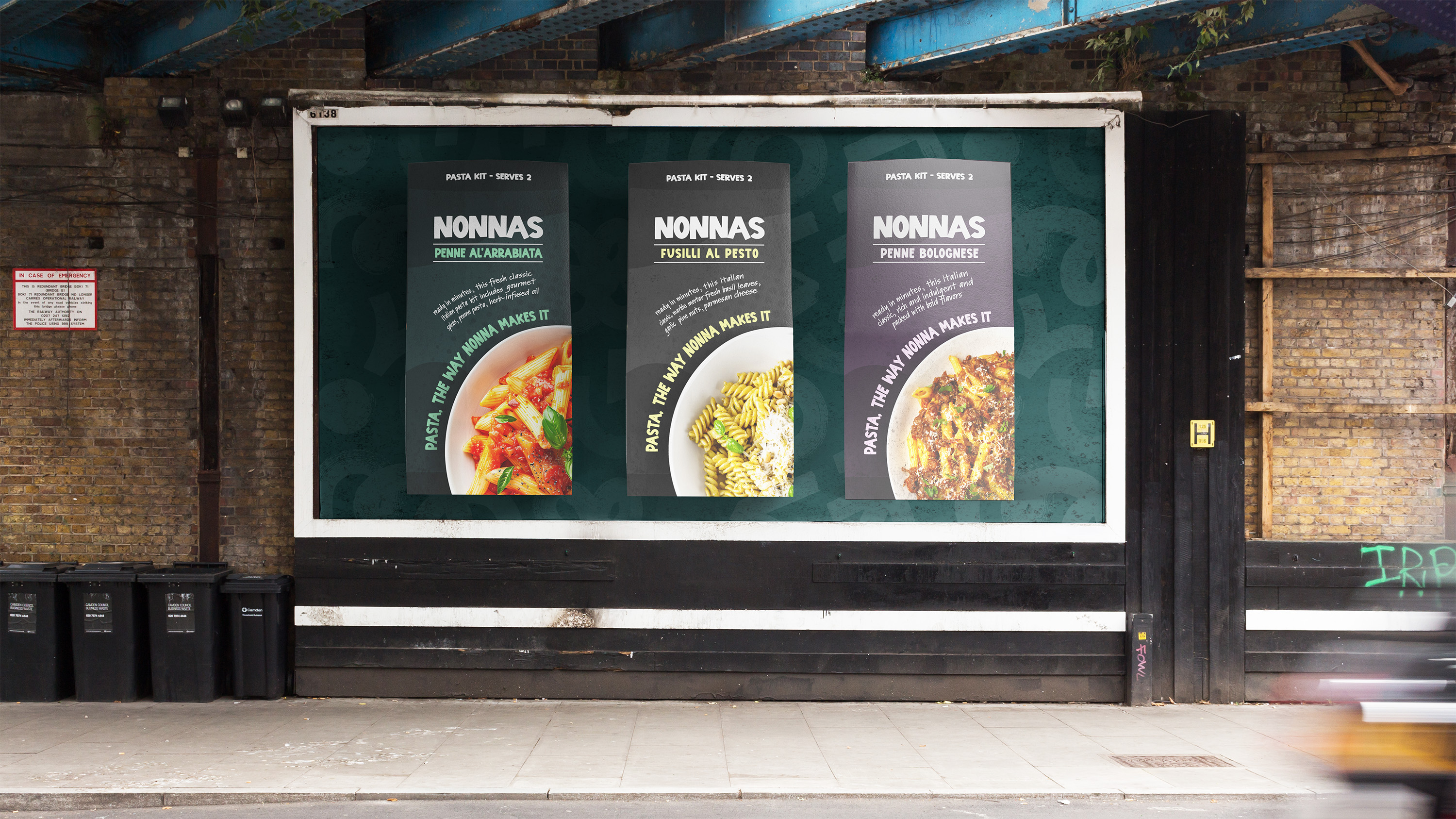
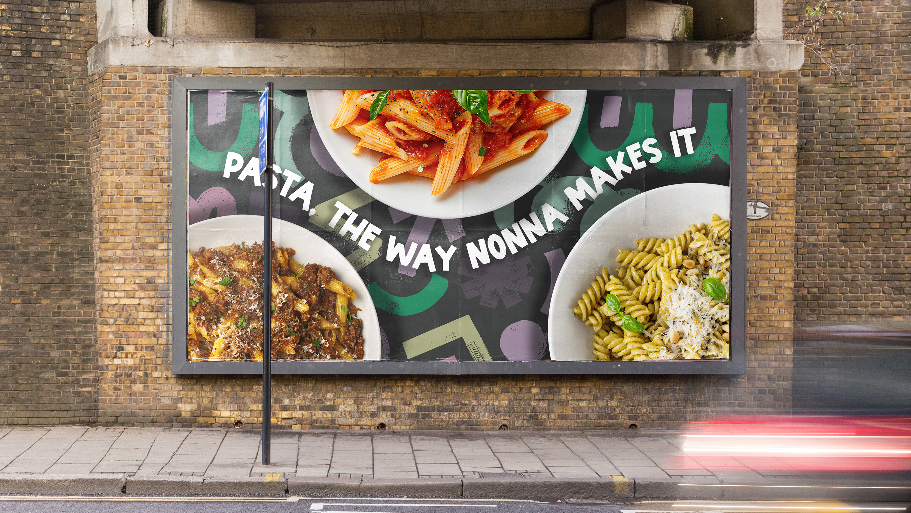
For this personal project, I set out to establish a brand dedicated to bringing authentic Italian pasta to every household.
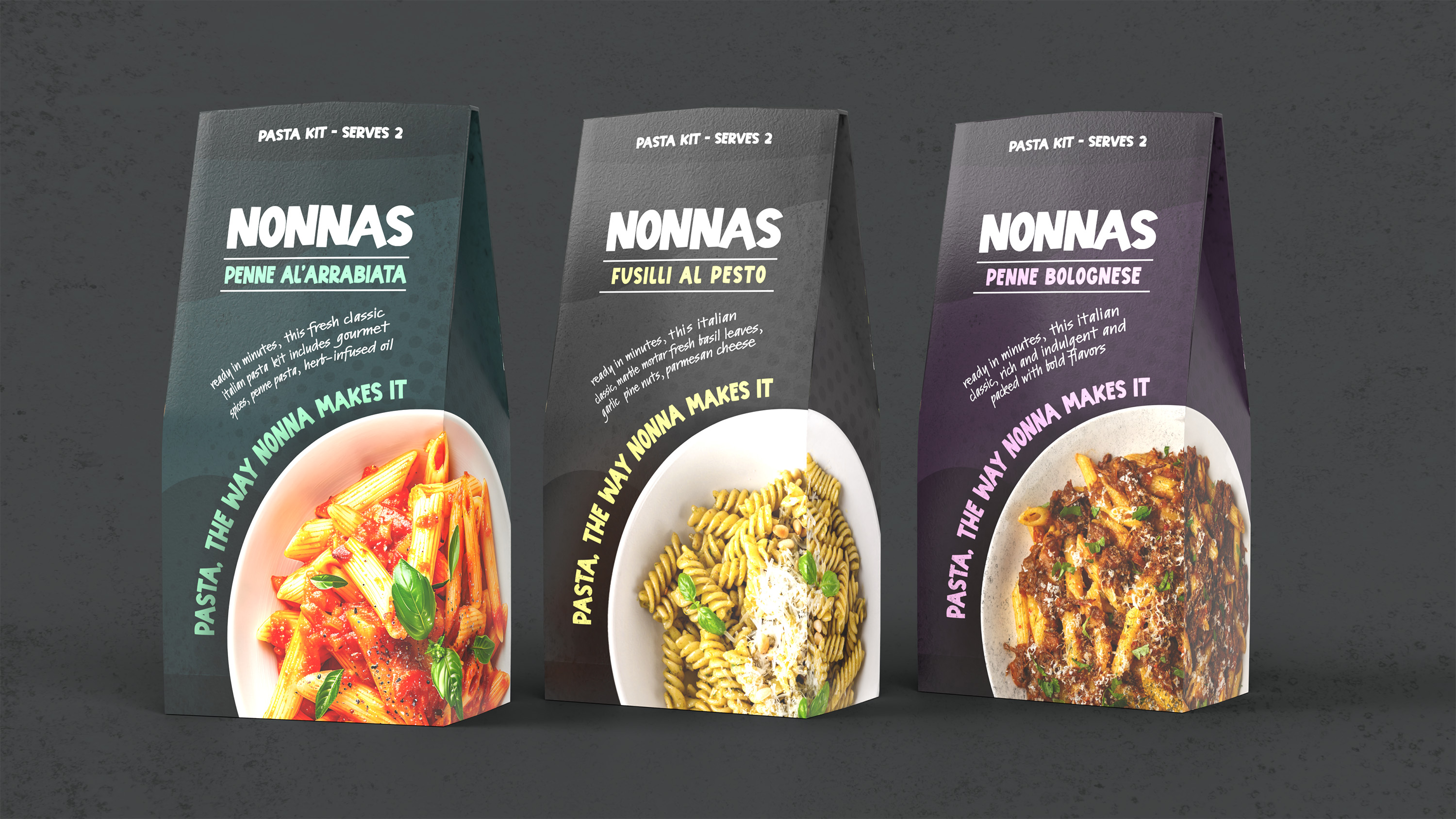
Nonnas' pasta kits, named after the Italian term for grandmother, provide all the secret ingredients needed to whip up authentic Italian dishes that would make Nonna proud.
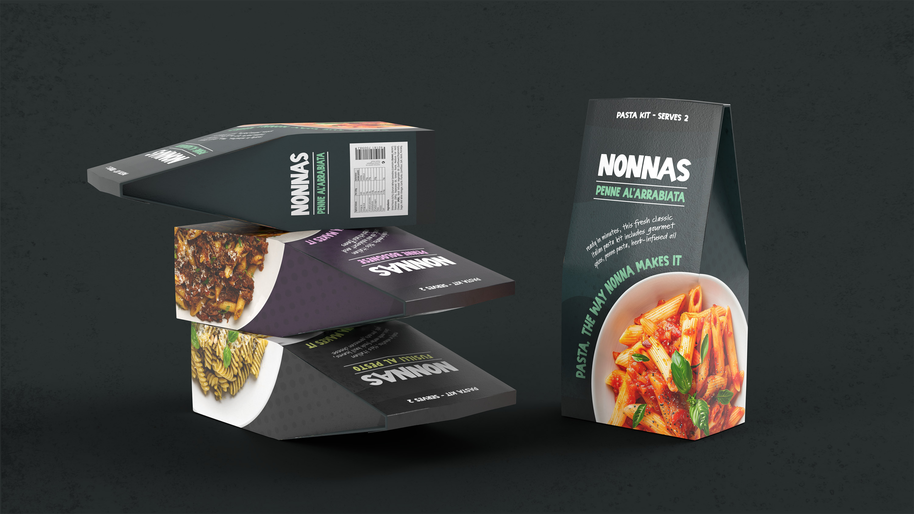
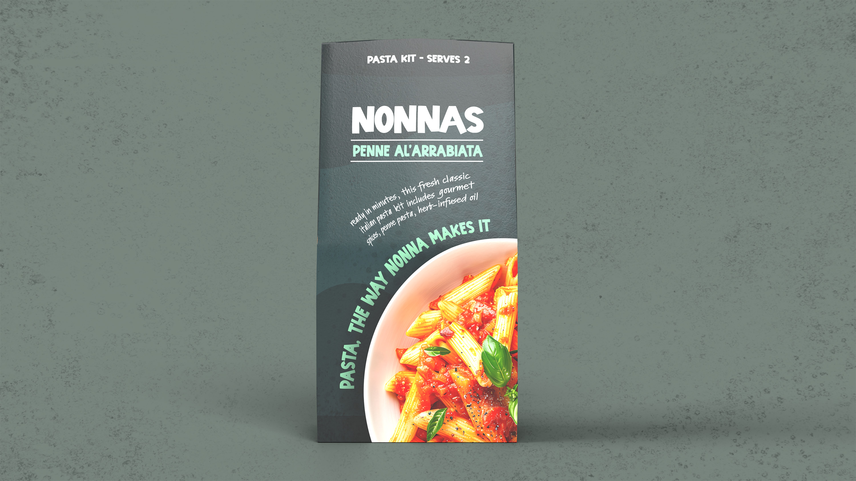
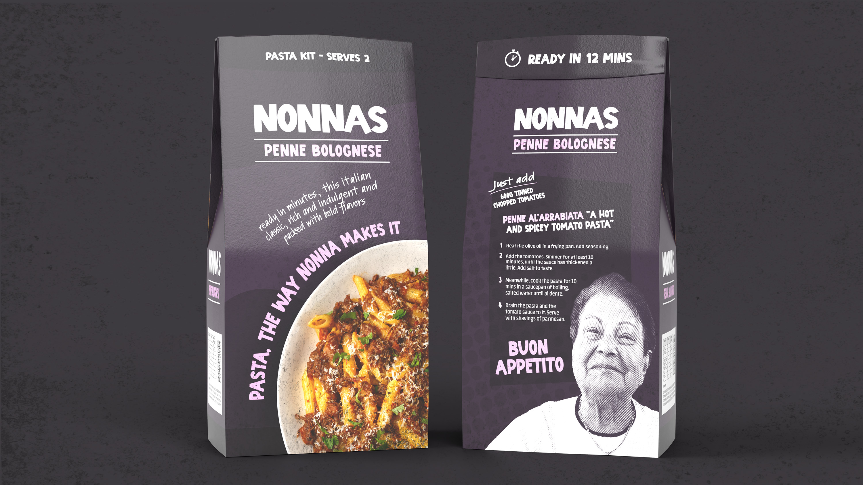
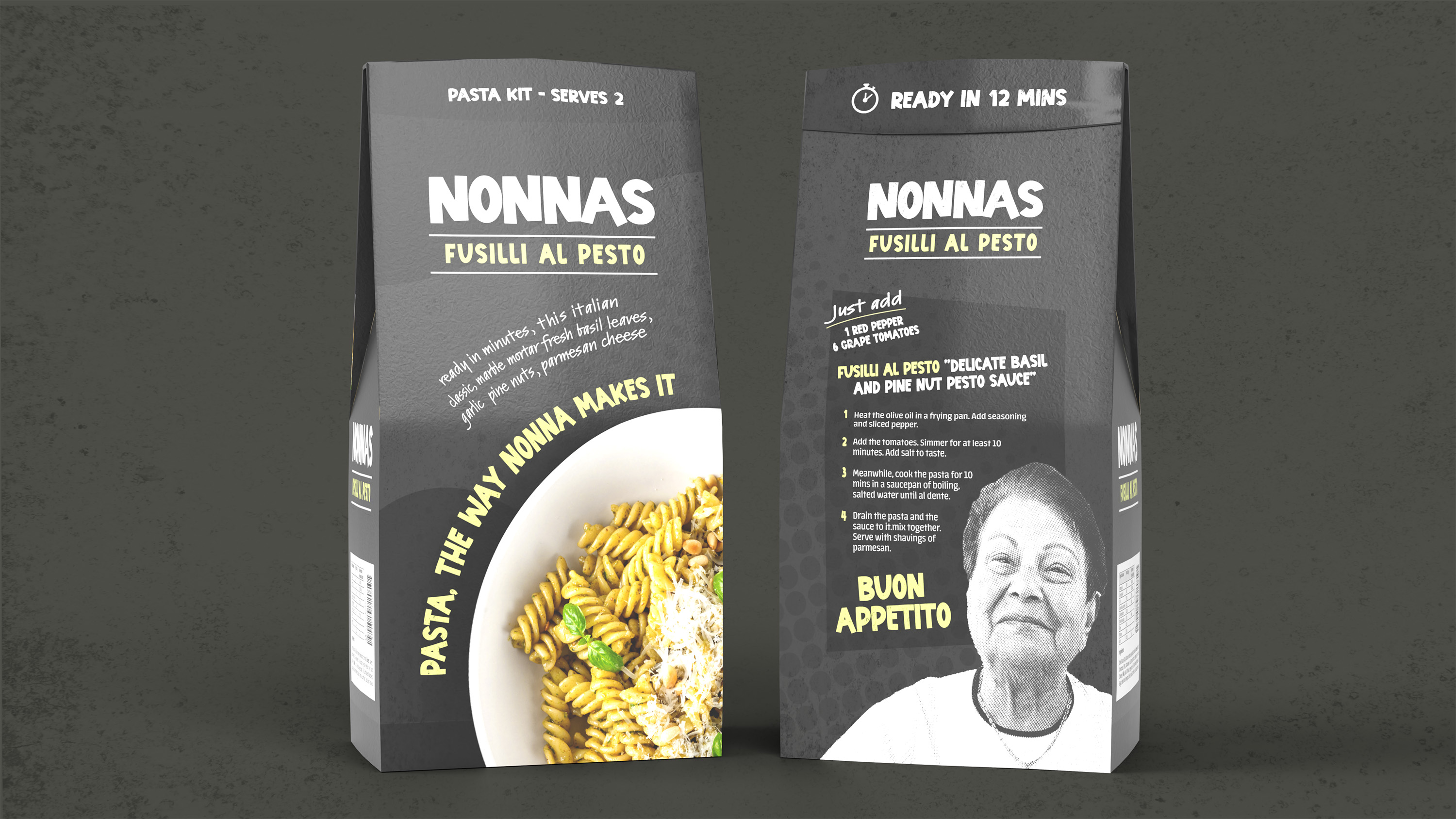
The packaging is crafted from fully recyclable and biodegradable materials, taking the form of a pouch for eco-friendliness.
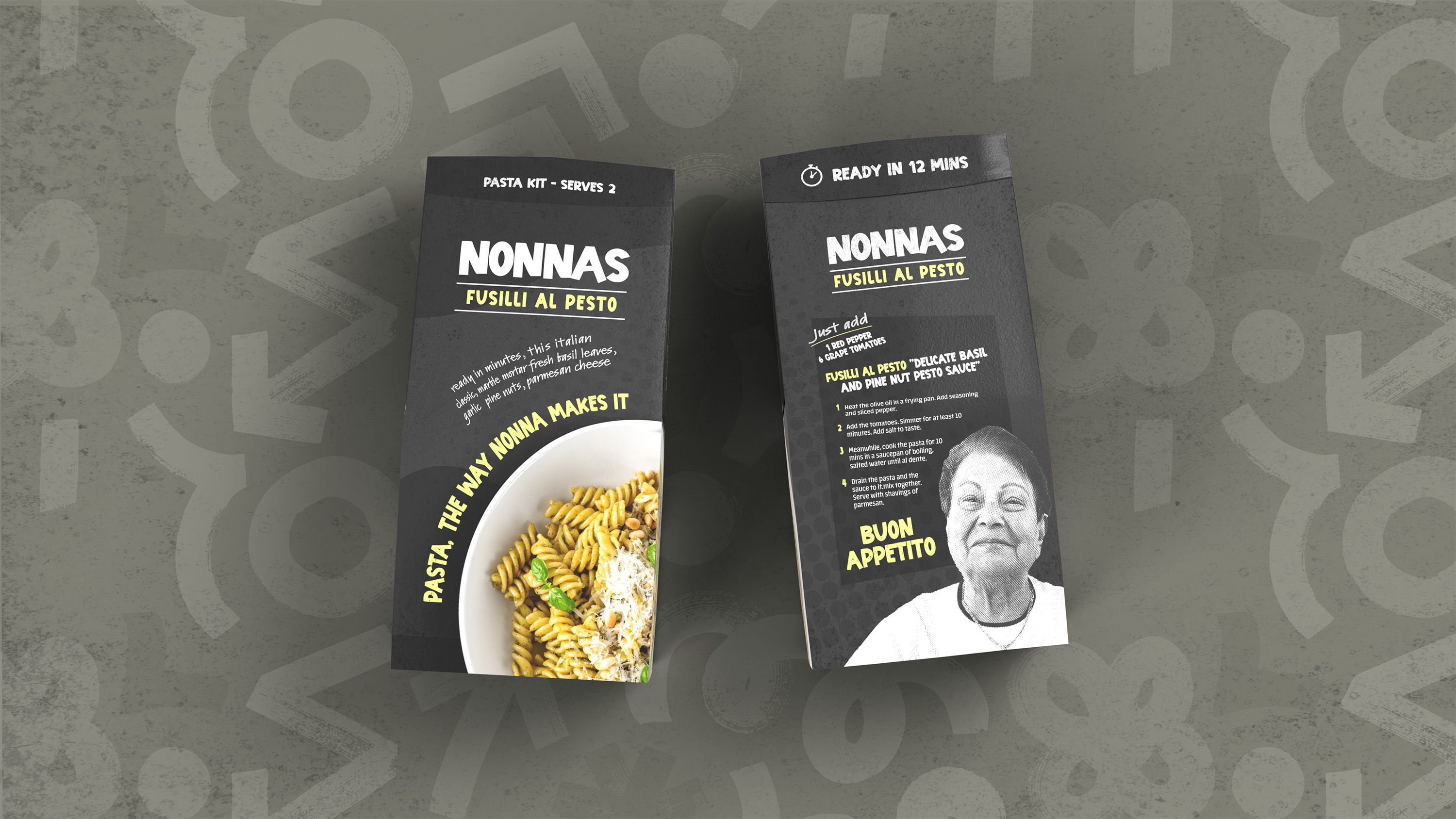
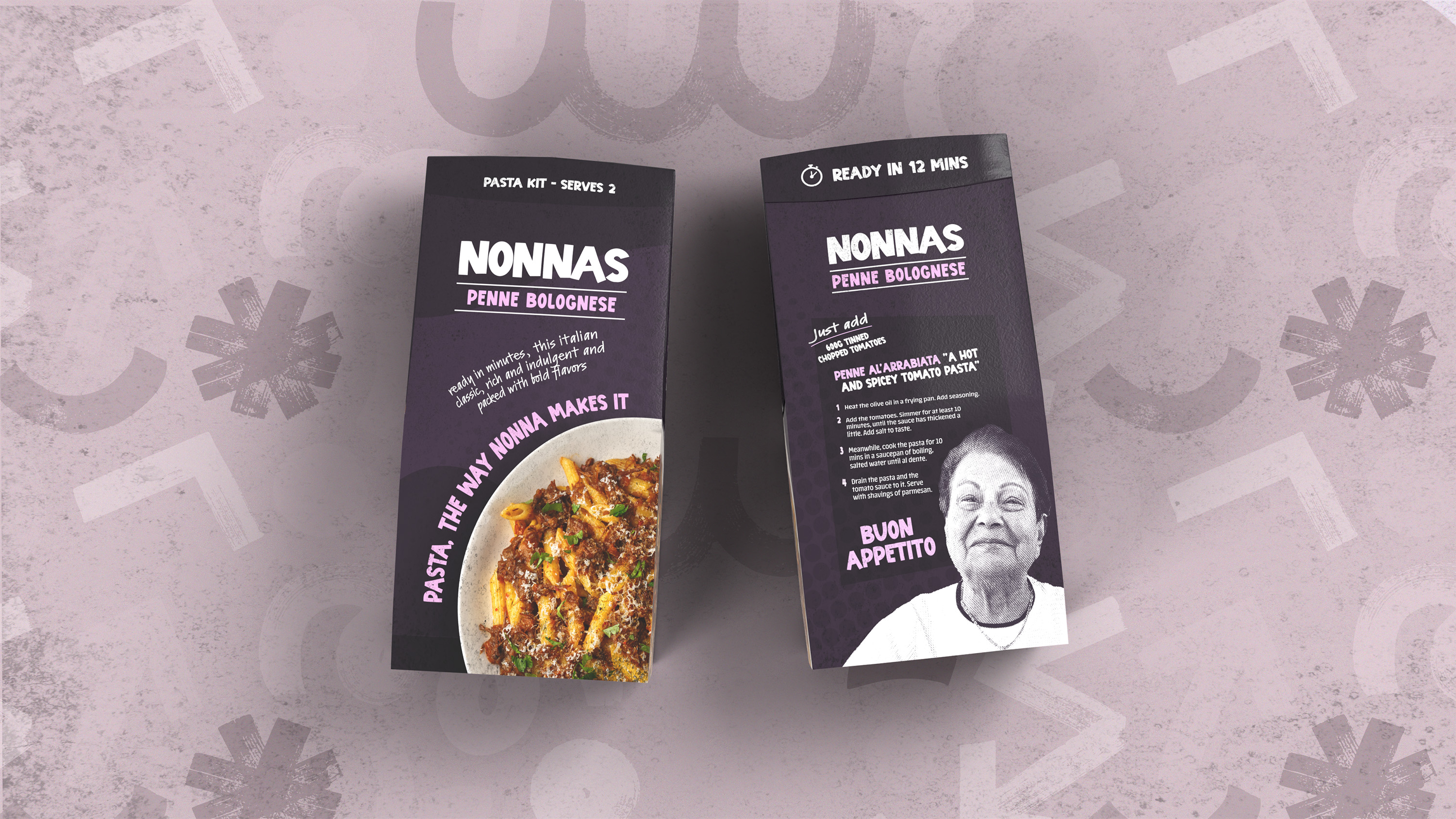
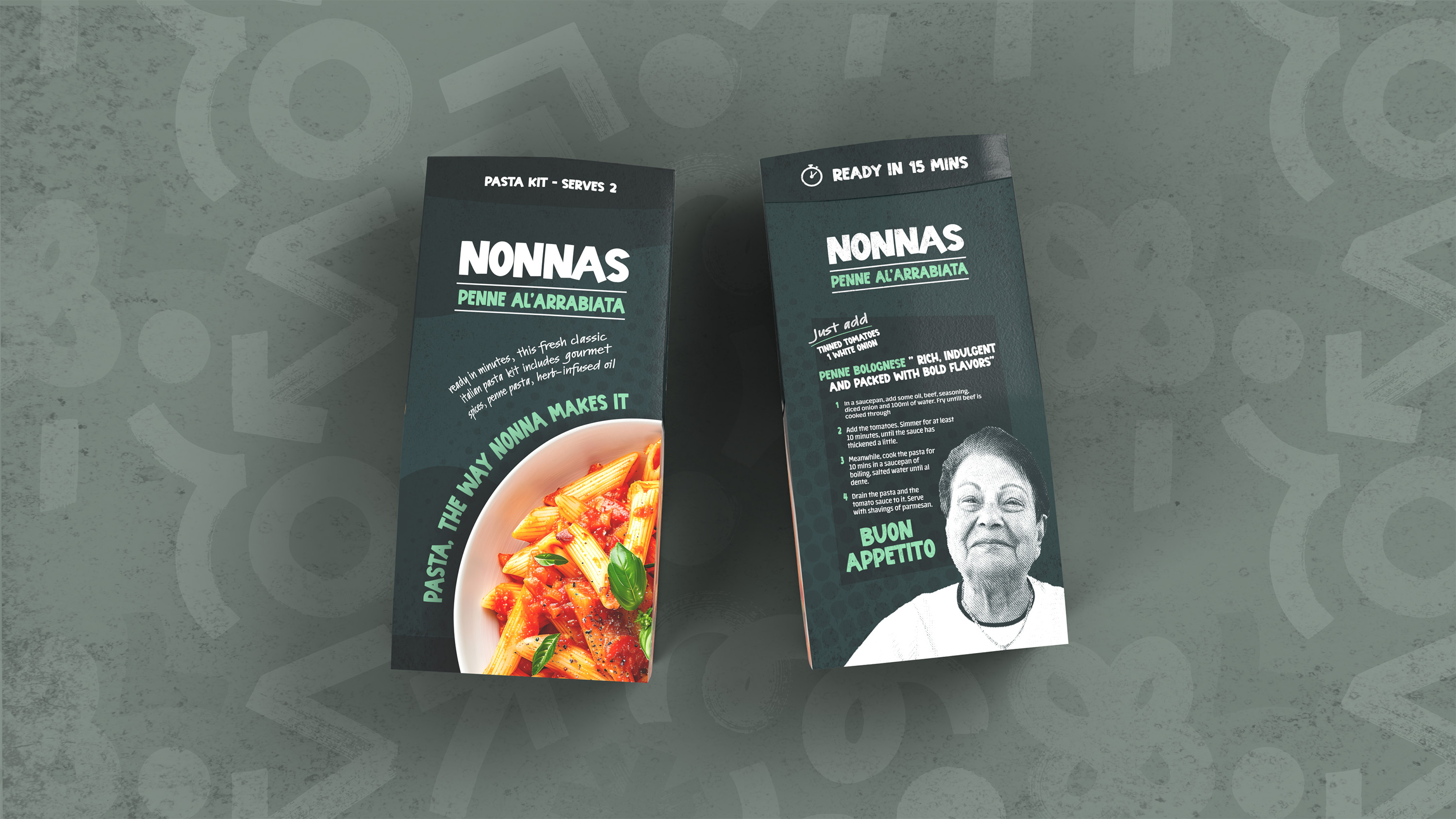
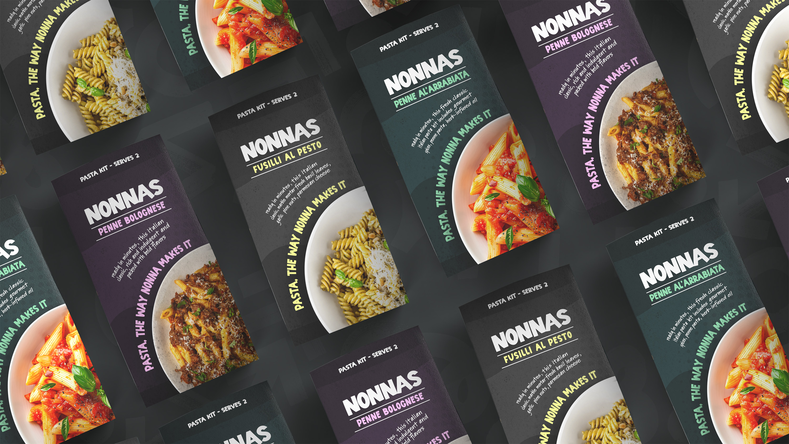
In terms of branding, I opted for earthy tones alongside vibrant accent colours. The use of a lively sans-serif typeface contributes to the welcoming and fun atmosphere of both the brand and packaging. Additionally, I incorporated a handwritten-style secondary typeface, aiming to evoke the feeling of a cherished family recipe passed down from generation to generation. This personal touch adds warmth to the brand and packaging.
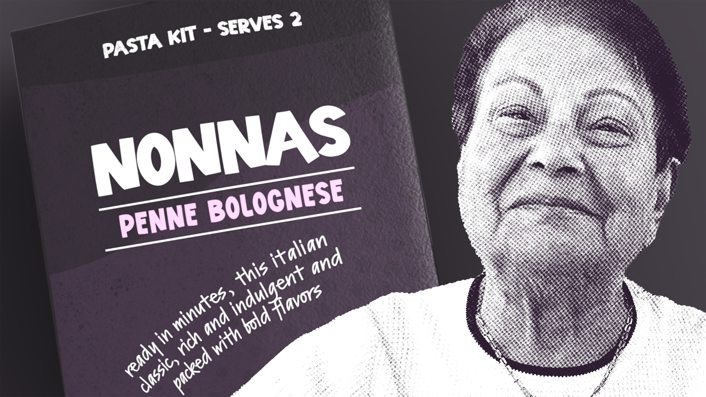
On the back of the packaging, a brand mascot featuring an image of my partner's Nonna, enhanced with a halftone effect and using colours corresponding to each product variant, serves to modernise the design and resonate with the target audience. The packaging and was was designed to invite customers to embrace the rich tradition of Italian cuisine by trying out the authentic pasta kits.
